6 Ways to Communicate Language Choices in Online Content


The internet is global so making your Authoritative Content available in multiple languages can easily increase your reach, expand your brand, and build your audience.But there is a problem. How do you communicate language choices in your web design in a streamlined yet effective way? The answer to this question is critical to the user experience on your blog or website. Make the wrong choice and you're putting up unnecessary barriers to entry to your content.There are a number of options available to represent language choices online. Here are six of the most common:
1. Flags

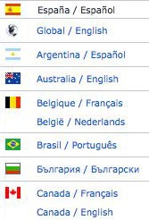
Showing icons of flags to represent the languages that your content is available in is the most popular way of communicating language choices to online audiences, but it's not that simple.What about countries where multiple languages are spoken? What about languages that are spoken in multiple countries?If a Canadian visits your blog or website, will they see your content in English or French after they click the Canadian flag? Do they have to click the flag for France to get the French version of your site? Simply using flags to represent language choices is limiting and can be confusing to people in some parts of the world.
2. Text
Text certainly solves the problems that using flags alone creates for online audiences, but it is not without its own problems.First, text is long and can make a web page appear very cluttered. Second, each language needs to be listed in that language, not in the primary language of the site.For example, listing the native language of France as "French" won't help French speakers who don't speak English. Instead, you need to include "Francais" in your text list of language choices.
3. Visual Representation and Text

A visual representation combined with text solves some of the problems of flag-only and text-only language choices.You could show a flag with text, or you could show a different icon (like a globe) to represent the availability of different languages along with text. When a visitor clicks on the globe, it leads to pop-up or page with all language choices listed to choose from.Again, the text in the list must be in the native language it represents, and if the list uses flags, there needs to be multiple flags for individual countries to represent the various languages spoken in those countries. The list can get long and very cluttered, which is why it needs to be in a separate pop-up window or page.
4. Language Icon

The language icon was first developed in 2008 as a solution to the language selection problems on websites.In 2013, the current form of the language icon was designed by Farhat Datta. You can learn more about the language icon, how to use it, and download it on the Language Icon website.While the language icon seems like a great solution to communicate language choices to online audiences, it hasn't caught on to a great degree. Therefore, many visitors to your website or blog won't recognize it.
5.The Google Translate Icon

If you use Google Chrome as your web browser and have the Google Translate Chrome extension installed on your computer, then you've probably seen the Google Translate icon.Did you know that you can add a Google Translate widget to your website or blog and offer a list of languages for visitors to choose from? It's quick and easy to add to just about any website.However, the translations that are automatically generated from Google Translate are far from perfect and can hurt the user experience on your blog more than they can help the experience. In short, Google Translate seems like a simple fix to the content translation problem, but it often adds more problems than most online publishers want to take on.
6. Automated Location Detection
You can set up your website or blog to identify a visitor's language automatically by detecting their location at the moment they visit.Auto-detection sounds great, but what happens to people who are accessing your site while they're visiting foreign countries where a different language is spoken than their native language? What happens to people who live in countries where multiple languages are spoken?Some auto-detection tools use a person's web browser settings to match a language to that user, but this is still not a perfect solution. There will be errors, so make sure it's very easy for people to make their own language choice at any moment when they're on your site.
What Should You Do?
There is no perfect solution to offer your online content in multiple languages and to communicate those language choices, so use the method that best matches your audience's needs and your content goals.Do you offer your online content to visitors in multiple languages? Which method do you use to communicate language choices? Leave a comment and share your thoughts.Image: WorldIslandInfo.com licensed CC BY 2.0


